See how I work and think, and watch step by step how I create one of my works from concept to completion with this photoshop tutorial.
Sorry about the long time since I last posted. I had to take a minor operation, but major enough to keep me away from the computer a few weeks. While I was in the hospital, I thought I might present some of the works I've done, showing you what steps and techniques I followed, but not pointing exactly the filters and tools used.The work I'm about to show you was done for the Photoshop Cafe Movie Poster Competition. For this poster, I thought at a fantasy movie scenario... a team of adventurers proceeds in a glorious quest to find a magic wand that is supposed to help them save their realm from the forces of evil. I started by making some stars on a night sky:
 Then I've added the hills covered with grass:
 A light behind the hills for contrast:
 Then some clouds added over the light in order to amplify it's effect:
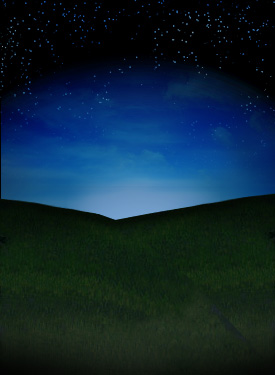 I have then added an unreal planet, something like a big moon, don't forget we still are in a fantasy realm:
 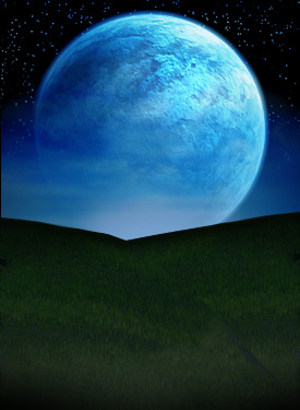 A rock:
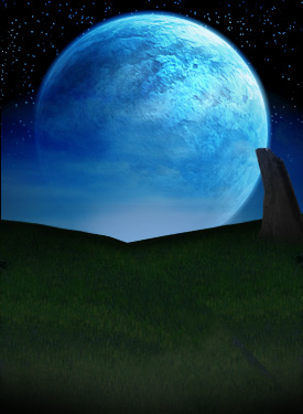 A path and some gravestones and a cross:
 Even more gravestones and crosses:
 Our 4 heroes (I put these just to see how they look like and I will later change them). I like how the silhouettes look in front of the light:
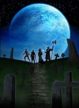 This is starting to be interesting; the wizzard starts using his powers. For higher contrast I used green and yellow colors on the wizzard's spell:
 I've added title and info to make it look more like a poster:
 I've lighten the grass to bring out it's texture and added the shadows. At this point, I am happy with the graveyard look.
Always try to refine your image if you don't like the looks of it, you can always do better; you just have to try until you are satisfied with the result. Add your details gradually:
 I've added more details in the title of the poster to make it pop-up more and I've added the name of the actors:
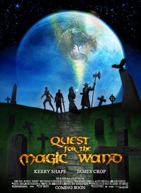 I've changed the 4 heroes and replaced them with others, keeping the silhouette-look, with the light behind:
 In the end, I modified the look of the wizzard's spell because I wanted more contrast and made it look like a phoenix, coming to help our adventurers in their noble quest. I was very happy with the result, but after working on more posters I decided this shouldn't be submitted in the Photoshop Cafe Contest.
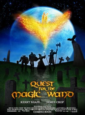 Thank you! Hope you liked this walkthrough. I will be back with many more, until then check out some of my other photoshop tutorials: